
Work / Bakery
Fennel & Rye
A two-oven neighbourhood bakery with a weekend queue and no name on the door. They sold rye, sourdough and seed buns from a counter that still said the old tenant's name, and wanted something that felt theirs without looking expensive.
What we did
- Drew a wordmark with a single wheat-ear mark that stamps cleanly on a paper bag and a window.
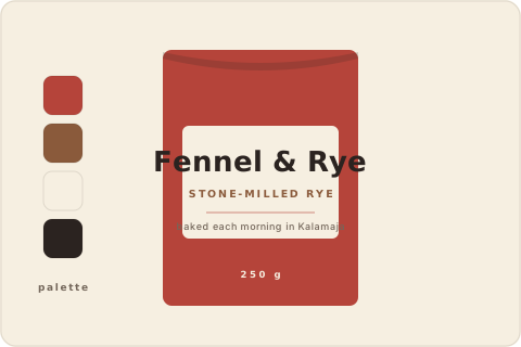
- Set a warm three-colour palette — rye red, crust brown and wheat — that a local printer could hit without a proof round.
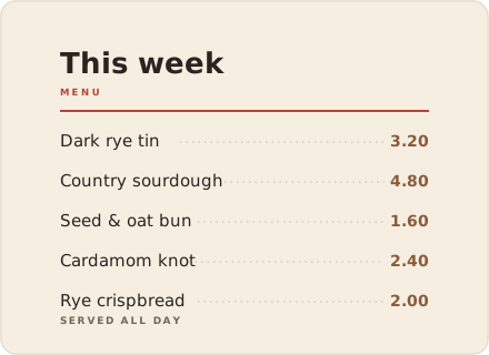
- Designed bag stamps, a loaf-label sheet and a chalk-style counter menu they update themselves.
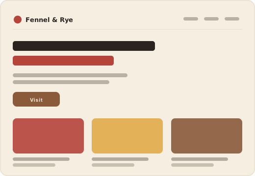
- Built one quiet page with the week's bakes and opening hours, quick to load on a phone in the queue.
The outcome
The bag stamp became the sign: they inked it straight onto the window. Weekend pre-orders now come in by email instead of by shouting over the counter.
“We wanted to look like we'd always been here. Now we do.”— Owner, Fennel & Rye